 I’ve been working a little with the latest Windows Phone 7 development options in Visual Studio 2010. Fun stuff!
One widget I was recently working on was a modified ListBox.
Essentially, the idea was to have a normal ListBox, where each Item (the ListBoxItem ControlTemplate) was actually a TextBlock (to show the actual item name), and a custom control (for editing addresses in this case). For the user, clicking an item “opened” the listbox to reveal the address associated with that item. Clicking again closed the item and the ListBox once again looked like a plain ol’ ListBox.
This is also sometimes called an Accordion Box.
The problem (actually, there were several problems, this was just one <g>) was that when the custom control was “revealed”, the ListBox would no longer scroll quite right. If the user was at the very end of the list, invariably, the last bit of the ListBox contents was cut off.
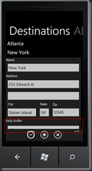
Here’s a picture of the bare ListBox with two items.
The red box is my own highlight (not part of the phone’s UI). When the user clicks on “New York” for instance, they should see this.
Note the highlighted area at the bottom. Even though I could press and drag the list box contents “up”, it would spring right back to this look when I let go. As a result, that last textbox would never be fully visible on-screen.
Not good.
The Solution
Turns out, the solution is simple, but I never was able to find it online (though I did find this exact question asked on StackOverflow, no solution there either).
The ListBox will automatically size itself to fit its contents under normal circumstances. If the list is small, that’s fine, but if the list is bigger than a screen, and the listbox isn’t positioned at the VERY TOP of the screen, that can cause problems, the kind of which I was seeing.
To fix it, you can simply set the HEIGHT property of the ListBox to something other than Auto. While this DOES WORK, it’s not terribly elegant. What if the page needs to handle being switched to landscape mode?
In this case, the ListBox itself was a child (the only child) of a StackPanel, that itself was the only child of the PivotItem you see above, which was a child (among several) of a Pivot control.
The StackPanel was being sized properly (I could tell by setting it’s border to red and running the app), so the problem was with the ListBox only.
Then it hit me.
Databind the ListBox HEIGHT property to the StackPanel ActualHeight property (you can’t use the StackPanel’s HEIGHT property because, most likely, it’s set to Auto as well).
Here’s the XAML…
<controls:PivotItem Header="Destinations" Margin="0,0,12,0" Name="pvtItemDestinations">
    <StackPanel Name="stkDestinations">
        <ListBox Name="lstDestinations" HorizontalContentAlignment="Stretch" Height="{Binding ElementName=stkDestinations, Path=ActualHeight, Mode=OneWay}">
            <ListBox.ItemTemplate>
                <DataTemplate>

                ...
                Data template here
                ...

                </DataTemplate>
            </ListBox.ItemTemplate>
        </ListBox>
    </StackPanel>
</controls:PivotItem>
You can see the PivotItem, with the contained StackPanel, and within it, the ListBox.
The key is the Height="{Binding ElementName=stkDestinations, Path=ActualHeight, Mode=OneWay}".
This binds the height of the ListBox to the ActualHeight of its container. Once the Height of the Listbox is set to something other than “Auto”, its internal scrolling logic automatically kicks in and handles scrolling of variable item height items properly.
Simple, sweet, and all XAML!


