NOTE: I originally did this post back in 2007. I’ve updated it a few times since then with new fonts. I added Lucida Sans Typewriter at the request of a comment by Row Sham Bow. Also new is Inconsolata, DroidSansMono, Liberation Mono, and Monofur.
And for 2012, at the suggestion of Chris Nicholls, Borte.fon is also new.
Thanks to everyone who’s pointed me to new fonts to try!
I’ve tried out the newer fonts for varying lengths of time, but, at least so far, I still end up back with Consolas.
But if you have a favorite font you’d like mentioned, please let me know!
I’ve noticed something a bit peculiar about fonts and programmers.
There’s the camp that’s thoroughly researched the topic, experimented with piles of fonts and ended up selecting one that they can be quite vocal about.
And then there’s the camp there never changes the default that came setup in the IDE they installed.
I guess I come from the former. Courier? No way. Arial? Ack! Programming in a variable width font just seems, so, ewww. I was a good, old fashioned FixedSys man for ages. It was decent, had a nice fixed width, slightly too bold, but I could live with it, came with every copy of windows and was pretty legible across all the common characters. But about a year ago, I embarked on a quest to find a better font.
Many, many downloads later, I believe I’ve ended up with the best of the options out there. The freely available ones, anyway.
I’ve taken screen snapshots of all fonts at approximately 14pt size. I used 14pt because it’s the most comfortable size for me.
I’ve also included a snapshots of the better fonts at different sizes, so you can get a feel for how they scale.
Bitmap fonts
I’m not a big fan of the bitmap fonts (the FON files). They don’t scale well except where they’ve been defined at multiple sizes (not really scaling), and don’t believe they take advantage of ClearType, certainly not very well. Still, there are some interesting bitmap fonts out there.
Most of the good ones are intended to be used as very small fonts. If you have eagle vision, some of them might work quite well. But my eyes would jump screaming from my their sockets if I tried to program in some of these all day.
 |
10×20-iso8859-1.fon | Not bad but it doesn’t scale. Some elements bleed too much. |
 |
9×15-iso8859-1.fon | Too thin for me |
 |
9×18-iso8859-1.fon | Also too thin |
 |
BSUKermit.FON | Base size is too small. Doesn’t scale |
|
Borte.FON | A bit small and thin for me, but otherwise looks very clear. Doesn’t scale |
 |
Dina.fon | Base size is too small. Doesn’t scale |
 |
DOSLIKE.FON | Not bad, but it doesn’t scale. Has a few too many serifs for my taste. |
 |
GwdTE_437.fon | Base size is too small. Doesn’t scale |
 |
Hackd.ttf | My own custom version of Hack, ligatures, slashed zero, nice percent, Powerline glyphs |
 |
Hyperlt.fon | Actually called HyperFont LT |
 |
IBMPC.fon | 10pt. Yikes. Quite small. |
 |
IBMPC.fon | 14pt. This is what happens when bad fonts scale. |
 |
PROFONT.FON | 12pt. Too small, and the letters bleed together at this size. |
 |
PROFONT.FON | 14pt. Way too thick at this size, plus kerning is wacked. |
 |
Raize.fon | 10pt. Not too bad, but too small for me. |
 |
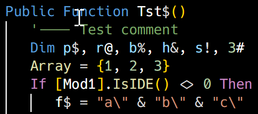
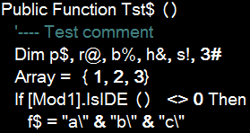
Raize.fon | 14pt. There’s just something about the letter shapes at this size that don’t feel right. |
![image_thumb2[1]](https://www.darinhiggins.com/content/binary/WindowsLiveWriter/BestProgrammingFont_935/image_thumb2%5B1%5D.png) |
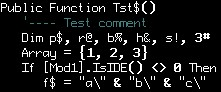
Sysmono.fon | As close to 14pt as I can get with this font. |
True Type Fonts
I prefer the true type fonts. They scale well all the way down to about 7 points, but they can take advantage of ClearType, and a few are even specially designed to make optimal use of it.
 |
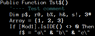
Arial.ttf | 14pt. Just for reference, a variable width font just doesn’t work for me and programming. |
![image_thumb3[1]](https://www.darinhiggins.com/content/binary/WindowsLiveWriter/BestProgrammingFont_935/image_thumb3%5B1%5D.png) |
Aerial Mono.ttf | 14pt. Pretty good. Seems a bit too bold. |
![image_thumb4[1]](https://www.darinhiggins.com/content/binary/WindowsLiveWriter/BestProgrammingFont_935/image_thumb4%5B1%5D.png) |
Andale Mono.ttf | 14pt. Quite good. This one was in the running for a while. |
![image_thumb5[1]](https://www.darinhiggins.com/content/binary/WindowsLiveWriter/BestProgrammingFont_935/image_thumb5%5B1%5D.png) |
AnonymousRegular.ttf | 14pt. Yikes, serifs and programming just don’t mix. |
 |
AnonymousRegular.ttf | 11pt. Smaller size, same serif problems. I do like the zero, however. |
 |
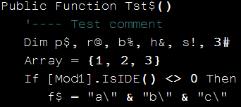
Bitstream Vera Sans Mono.ttf | 14pt. Excellent font. Maybe just a tad too bold, but this one was also in the running. |
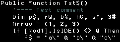
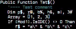
![image_thumb1[1]](https://www.darinhiggins.com/content/binary/WindowsLiveWriter/BestProgrammingFont_935/image_thumb1%5B1%5D.png) |
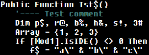
Consolas.ttf | 14pt. Excellent all around. |
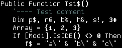
 |
Consolas.ttf | 10pt. For reference. Scales well. |
 |
DroidSansMono.ttf | 12pt. Very good font. Google makes it available free here. Only downside is the zero is not slashed. |
 |
Everson Mono Unicode.ttf | 14pt. Very good, but the letters seem to be a bit thinner than numbers and symbols, which looks odd to me. |
 |
Fixedsys.ttf | 14pt, note this is the TTF version of the FixedSys font, not the bitmapped version. It’s too heavy for me. |
 |
HyperFont.ttf | 14pt. Not bad but similar problems to Everson Mono. |
 |
Inconsolata.ttf | 12pt. A nice font but I don’t really care much for what anti-aliasing does to it. It seems fuzzier than necessary and some letters end up with a nib below them, which I don’t care for. |
 |
Larabiefont Bold.ttf | 14pt. Wow. Those zeros. oh, wow. Screams l33t! |
 |
Letter Gothic Line.ttf | 14pt. This one’s not too bad, but check out the lower case m’s. Funky. |
 |
LiberationMono.ttf | 12pt. A very good font. Available here. Very much a contender for a top spot, but it uses a dotted zero instead of a slash. |
 |
Lucida Sans Typewriter | 12pt. Not bad, though it seems a little thin to stare at all day. |
 |
Monaco.ttf | 14pt. Excellent font. Originally from the Mac. the parens are a little odd, but this was definitely in the running. |
 |
Monofur.ttf | 12pt. Good but a little odd to program in all day long. The dotted ‘zero’ doesn’t feel right to me, but I do like the symbols. |
 |
PixelCarnageMonoTT.ttf | 14pt. Hmm, seems small for 14pt. Decent, but not right for me. |
 |
ProFontWindows.ttf | 14pt. The “u”, “n” and “c” threw me. This is just a little too “programming in the FUTURE.. FUTURE.. FUTURE.. FUTURE”. |
 |
ProggyCleanTT.ttf | Intended to be used small. Ouch, my eyes! |
 |
Reader Sans Roman.ttf | 14pt. Funky horizontals. |
 |
Terminal.ttf | 12pt. Decent, available, a bit thick in general. |
 |
Terminal.ttf | 8pt. Fine if you don’t mind going blind at 30. |
 |
Ti92Pluspc.ttf | 14pt. Not bad but a little tall for my taste. Any shorter, though, and it gets too thin. |
 |
Topaz-8.ttf | 14pt. Ugh. Someone actually recommends this? |
Finding the Fonts
I found all these fonts through various sites. Googling the font file name should get you where you want to be. I’m not sure as to posting the fonts for download here, so I’m erring on the side of safety. I apologize in advance for making you hunt them down.
The Winner
I chose Consolas in the end, for several reasons:
- It comes with the newer Windows and it’s a VERY high quality font.
- The symbols aren’t weird, and most of them, plus the parentheses, kind of ‘pop’, which I happen to like.
- It’s got a good slashed zero
- Line spacing is nice. Not too tight or loose.
- It’s thick enough to avoid strange looking “thin spots” but not so thick as to be annoying or have characters bleed (like Terminal)
- No pseudo-serifs (like Anonymous)
I’m sure there’s a lot more possibilities out there, but I didn’t see them before I quit looking.
If you have a favorite font, let me know. If I can download it, and it’s a serious programmer font, I’ll add a sample.
If you tell me you program in Comic Sans, somewhere, out there, a daemon will abend.


