Category Archives: Fonts

Hacking Hack

833
Filed under Fonts, Text Editors, Visual Studio

First, the TLDR

Download my custom Hackd font here. Unzip, and install the two TTF files. That’s it.

On Programming Fonts

I’ve long been a fan of dedicated, monospaced programming fonts. I’ve even got a page here dedicated to a breakdown of most of the fonts I’ve had the opportunity to work with and review over the years.

I’ve used a number of these for a good period of time, including Consolas, Cascadia Code, and FiraCode among others.

But, for some time now, Hack has been my goto choice. It’s clear, simple, with good spacing, and excellent readability.

Alas…

As usual, though, there’s a few things that have always not sat well with me.

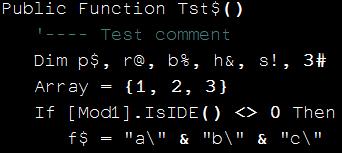
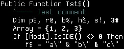
First, Hack has a peculiar dotted zero.

That’s just always seemed off to me.

Plus, it’s percent sign just didn’t jive with the rest of the font.

msedge_3oPHWPX4FB

And then there’s ligatures.

The Ligatures

If you aren’t familiar with ligatures, they’re basically substitutions of a single, conhesive glyph for 2 or more glyphs places next to each other.

For instance, a ligature for “greater or equal”, “>=” might look like this:

It’s important to note however, that ligatures are just a rendering nicety. They don’t actually change the characters you type at all. So, although it might look like one character on screen, your file’s content will still be “>=” just like it always has been.

I realize that there’s a lot of gnashing of teeth online about whether ligatures are worth it or not. In the end, I think it’s completely a matter of preference, and I happen to find them quite nice to look at and helpful during my day to day coding.

And Hack doesn’t have ligatures

When Monospaced isn’t Monospaced

Virtually all dedicated programming fonts are monospaced; every glyph has the same width. But, while a font might say that it’s monospaced, and might have all the right metadata to indicate that it’s monospaced, it turns out that all that doesn’t necessarily mean that it is monospaced.

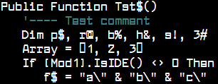
In fact, there are some apps out there that detect a monospaced font not via metadata, but rather via a Windows call that actually tests if all the glyphs are the same width.

I happen to use a couple of those apps and, as it happens, Hack doesn’t pass that test, so it’s not listed as a choice for font in those apps. And that has been a (rather admittedly trivial) thorn in my side for some time now.
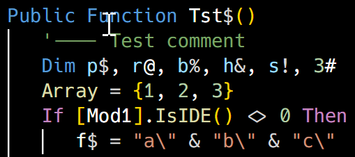
Introducing Hackd

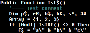
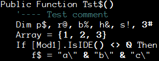
So without further ado, I’d like to present my own take on a programming font; Hackd!

Hackd is based on Hack v3.003, used for most base symbols and upper/lowercase latin glyphs.

I then merged in glyphs from FiraCode v6.002 for all ligatures and pretty much all other characters.

Further, I pulled the % glyph from Firacode and tweaked it slightly to look more “Hack”ish.


And finally, I merged in the Powerline glyphs from “Hack Regular Nerd Font Complete Windows Compatible” from the NerdFonts collection.

NOTE: I left out virtually all of the excess glyphs from NerdFonts, including company logos, weather symbols, etc. I just don’t see much utility in having them in the font, unless, maybe, there might be some use for them in some kind of command line terminal customization? I did include the PowerLine symbols for that reason.

Would love to hear any comments on that…

How I Did It

I used FontForge for all manipulations.

I started with FiraCode-Regular and FiraCode-Bold.

Replaced all the glyphs from ! through ascii 255 with the Hack glyphs.

Then pulled all the powerline glyphs from the Hack NerdFont ttf file.

Replaced the % sign using the FiraCode version, then tweaked it by scaling it and repositioning it slightly to look better.

Tweaked all glyph widths to be the same. This automatically causes FontForge to generate a proper “monospaced” font that truly is considered monospaced. Originally, Hack had several glyphs that had a 0 advance, which caused the font to not be considered monospace, even though it really should be.

Updated various metadata in fonts to reflect the history, source, new name and version number.

Repeated all this for both the Regular and Bold versions of the font.

What About Italics?

Once that was done and the new fonts installed, the regular, italics, bold and bold italics alternatives were all available, so I did not create the BoldItalic, Italic, BoldOblique or RegularOblique alternatives as they didn’t seem necessary.

Disclaimer

I’m no fontographer, and I definitely couldn’t have done this without the fantastic work done by the Hack and FiraCode authors, much less the author of FontForge, so my hat’s off to all of them!

Font choice is a highly personal thing, and this work reflects my own personal preferences and taste. My main reason for documenting this is to show that there are tools available that make this kind of customization completely possible, if not easy.


Best Programming Font

34
Filed under Font, Fonts, VB Feng Shui
Tagged as

NOTE: I originally did this post back in 2007. I’ve updated it a few times since then with new fonts. I added Lucida Sans Typewriter at the request of a comment by Row Sham Bow. Also new is Inconsolata, DroidSansMono, Liberation Mono, and Monofur.
And for 2012, at the suggestion of Chris Nicholls, Borte.fon is also new.
Thanks to everyone who’s pointed me to new fonts to try!

I’ve tried out the newer fonts for varying lengths of time, but, at least so far, I still end up back with Consolas.

But if you have a favorite font you’d like mentioned, please let me know!

I’ve noticed something a bit peculiar about fonts and programmers.

There’s the camp that’s thoroughly researched the topic, experimented with piles of fonts and ended up selecting one that they can be quite vocal about.

And then there’s the camp there never changes the default that came setup in the IDE they installed.

I guess I come from the former. Courier? No way. Arial? Ack! Programming in a variable width font just seems, so, ewww. I was a good, old fashioned FixedSys man for ages. It was decent, had a nice fixed width, slightly too bold, but I could live with it, came with every copy of windows and was pretty legible across all the common characters. But about a year ago, I embarked on a quest to find a better font.

Many, many downloads later, I believe I’ve ended up with the best of the options out there. The freely available ones, anyway.

I’ve taken screen snapshots of all fonts at approximately 14pt size. I used 14pt because it’s the most comfortable size for me.

I’ve also included a snapshots of the better fonts at different sizes, so you can get a feel for how they scale.

Bitmap fonts

I’m not a big fan of the bitmap fonts (the FON files). They don’t scale well except where they’ve been defined at multiple sizes (not really scaling), and don’t believe they take advantage of ClearType, certainly not very well. Still, there are some interesting bitmap fonts out there.

Most of the good ones are intended to be used as very small fonts. If you have eagle vision, some of them might work quite well. But my eyes would jump screaming from my their sockets if I tried to program in some of these all day.

image 10×20-iso8859-1.fon Not bad but it doesn’t scale. Some elements bleed too much.
image 9×15-iso8859-1.fon Too thin for me
image 9×18-iso8859-1.fon Also too thin
image BSUKermit.FON Base size is too small. Doesn’t scale
image Borte.FON A bit small and thin for me, but otherwise looks very clear. Doesn’t scale
image Dina.fon Base size is too small. Doesn’t scale
image DOSLIKE.FON Not bad, but it doesn’t scale. Has a few too many serifs for my taste.
image GwdTE_437.fon Base size is too small. Doesn’t scale
image Hackd.ttf My own custom version of Hack, ligatures, slashed zero, nice percent, Powerline glyphs
image Hyperlt.fon Actually called HyperFont LT
image IBMPC.fon 10pt. Yikes. Quite small.
image IBMPC.fon 14pt. This is what happens when bad fonts scale.
image PROFONT.FON 12pt. Too small, and the letters bleed together at this size.
image PROFONT.FON 14pt. Way too thick at this size, plus kerning is wacked.
image Raize.fon 10pt. Not too bad, but too small for me.
image Raize.fon 14pt. There’s just something about the letter shapes at this size that don’t feel right.
image_thumb2[1] Sysmono.fon As close to 14pt as I can get with this font.

True Type Fonts

I prefer the true type fonts. They scale well all the way down to about 7 points, but they can take advantage of ClearType, and a few are even specially designed to make optimal use of it.

image_thumb5 Arial.ttf 14pt. Just for reference, a variable width font just doesn’t work for me and programming.
image_thumb3[1] Aerial Mono.ttf 14pt. Pretty good. Seems a bit too bold.
image_thumb4[1] Andale Mono.ttf 14pt. Quite good. This one was in the running for a while.
image_thumb5[1] AnonymousRegular.ttf 14pt. Yikes, serifs and programming just don’t mix.
image_thumb6 AnonymousRegular.ttf 11pt. Smaller size, same serif problems. I do like the zero, however.
image_thumb7 Bitstream Vera Sans Mono.ttf 14pt. Excellent font. Maybe just a tad too bold, but this one was also in the running.
image_thumb1[1] Consolas.ttf 14pt. Excellent all around.
image_thumb4 Consolas.ttf 10pt. For reference. Scales well.
DroidSansMono.ttf 12pt. Very good font. Google makes it available free here. Only downside is the zero is not slashed.
image_thumb8 Everson Mono Unicode.ttf 14pt. Very good, but the letters seem to be a bit thinner than numbers and symbols, which looks odd to me.
image_thumb1 Fixedsys.ttf 14pt, note this is the TTF version of the FixedSys font, not the bitmapped version. It’s too heavy for me.
image_thumb9 HyperFont.ttf 14pt. Not bad but similar problems to Everson Mono.
Inconsolata.ttf 12pt. A nice font but I don’t really care much for what anti-aliasing does to it. It seems fuzzier than necessary and some letters end up with a nib below them, which I don’t care for.
image_thumb10 Larabiefont Bold.ttf 14pt. Wow. Those zeros. oh, wow. Screams l33t!
image Letter Gothic Line.ttf 14pt. This one’s not too bad, but check out the lower case m’s. Funky.
LiberationMono.ttf 12pt. A very good font. Available here. Very much a contender for a top spot, but it uses a dotted zero instead of a slash.
Lucida Sans Typewriter 12pt. Not bad, though it seems a little thin to stare at all day.
image Monaco.ttf 14pt. Excellent font. Originally from the Mac. the parens are a little odd, but this was definitely in the running.
Monofur.ttf 12pt. Good but a little odd to program in all day long. The dotted ‘zero’ doesn’t feel right to me, but I do like the symbols.
image PixelCarnageMonoTT.ttf 14pt. Hmm, seems small for 14pt. Decent, but not right for me.
image ProFontWindows.ttf 14pt. The “u”, “n” and “c” threw me. This is just a little too “programming in the FUTURE.. FUTURE.. FUTURE.. FUTURE”.
image ProggyCleanTT.ttf Intended to be used small. Ouch, my eyes!
image Reader Sans Roman.ttf 14pt. Funky horizontals.
image_thumb2 Terminal.ttf 12pt. Decent, available, a bit thick in general.
image_thumb3 Terminal.ttf 8pt. Fine if you don’t mind going blind at 30.
image Ti92Pluspc.ttf 14pt. Not bad but a little tall for my taste. Any shorter, though, and it gets too thin.
image Topaz-8.ttf 14pt. Ugh. Someone actually recommends this?

Finding the Fonts

I found all these fonts through various sites. Googling the font file name should get you where you want to be. I’m not sure as to posting the fonts for download here, so I’m erring on the side of safety. I apologize in advance for making you hunt them down.

The Winner

I chose Consolas in the end, for several reasons:

  • It comes with the newer Windows and it’s a VERY high quality font.
  • The symbols aren’t weird, and most of them, plus the parentheses, kind of ‘pop’, which I happen to like.
  • It’s got a good slashed zero
  • Line spacing is nice. Not too tight or loose.
  • It’s thick enough to avoid strange looking “thin spots” but not so thick as to be annoying or have characters bleed (like Terminal)
  • No pseudo-serifs (like Anonymous)

I’m sure there’s a lot more possibilities out there, but I didn’t see them before I quit looking.

If you have a favorite font, let me know. If I can download it, and it’s a serious programmer font, I’ll add a sample.

If you tell me you program in Comic Sans, somewhere, out there, a daemon will abend.

Using Arbitrary Fonts In a Web Page

0
Filed under Fonts, Javascript, Web

image I’ve written here about how to embed arbitrary fonts in a flash file. This approach works, but it has several downsides.

  1. You have to have Flash. It’s not necessarily cheap.
  2. You have to go through a pretty arduous process to embed the fonts.
  3. You end up with a swf file that can be quite large, especially if you have a lot of fonts you need to embed. This can have a very negative impact on your bandwidth and the user’s experience with your site.

I understand that SilverLight has a method for using embedded fonts as well, though I’ve found very little information on it.

But I did recently come across True Font Family.

It’s not a 100% solution, since it essentially replaces specifically styled text on your site with dynamic images of that text in the font of your choosing. But, it’s got some great benefits.

  • It’s cheap, as in 27$, no royaties
  • It’s easy. Just a simple Javascript include, and a little CSS markup.
  • It’s double plus easy. You just upload the fonts you need to use as TTF files to your webserver somewhere. No messing with conversions of any kind. And since the fonts you use can be locked up in a secure spot on your server, there’s no worries of font use violations that might come from allowing end users to actually download the fonts you need for your site.

Plus, they’ve got a newer version coming out sometime in the fall that’ll do all sorts of special effects on the text as it’s rendering it.

Depending on your needs, this might be a very viable alternative to Flash.

Fixing Fonts that Won’t Install

1
Filed under Fonts, Utilities

image Previously, I wrote a bit about fonts that won’t install under Vista (and possibly Windows XP SP2, but I haven’t tested that).

Apparently, Vista expects certain fields within the TTF file to be filled, whereas older versions of Windows don’t. The result is that while you might have been able to install a particular TTF file perfectly fine under an older version of Windows, the same font won’t install under Vista, with Vista claiming the font is corrupted.

Enter Font Creator Pro 5.6, a utility to actually allow you to edit fonts. One of its ancillary features, however, is the ability to correct this problem in TTF files quite easily.

Unfortunately, it’s a very manual process, requiring a lot of mousing or keyboarding.

Until now!

I cobbled up a short little VBScript that will accept either dragging and dropping onto it, either:

  • a single TTF file
  • Several TTF files
  • or a single folder containing a bunch of TTF files

The script essentially automates the process of loading the font into Font Creator, applying the rename fix and saving the font out.

Note that it saves the font in place (for simplicity’s sake more than anything else), which means that you should make a backup of any font you process with this.

'FONT FIX SCRIPT
'Darin Higgins May 2009
'---------------------------------------------
'Requirements
'------------
'Eval or licensed copy of Font Creator 5.6
'
'Purpose
'-------
'Many Fonts will not install properly under Windows XP SP2 or Vista, because they are 
'missing a few values for several internal fields.
'While the field values themselves are immaterial, Windows will consider the font "corrupt"
'
'What this script does
'------------
'You can drag either a single TTF font file or a folder that contains a number of TTF files
'onto this script.
'The script will run and will use Font Creator to
'1) Open the font
'2) Perform a Font Creator "AutoName" on the font
'3) Close and save the font, overwriting the original file.
'
'I've never had problems but if you are concerned, be sure to make a backup copy of
'all your font files first.
'
'Usage
'-----
'1) Make sure that you've opened Font Creator, clicked past the eval screen
'   and have an empty window open before running this script
'2) Drag iether a single TTF file or a folder containing TTF files onto this script
'3) The script should run, with lots of window flashing.
'4) Don't touch anything, even if you hear beeps.
'5) Eventually the script will finish. It is possible that some files didn't get saved properly
'   so check each file with a good font viewer app.
'
'--------------------------------------------------

dim Name
Dim fso, fldr, s, file
dim shell
Dim Count, x
dim excel

Set shell = CreateObject("WScript.Shell")
Set fso = CreateObject("Scripting.FileSystemObject")
set Excel = nothing

for x = 0 to wscript.arguments.count-1
    Name = wscript.arguments(x)
    on error resume next
    '---- first, try to retrieve argument as a file
    if fso.FileExists(name) then
        '---- it worked, convert the single file
        Count = Count + 1
        CheckForQuit
        FixTheFont name
        CheckForQuit

    elseif fso.FolderExists(name) then
        '---- try to get a folder
        on error resume next
        Set fldr = fso.GetFolder(Name)    
        For each file in fldr.files
            if instr(1,ucase(File.Name),".TTF") <> 0 then
                Count = Count + 1
                CheckForQuit
                FixTheFont File.Path
                CheckForQuit
            end if
        next
    end if
next

'---- don't show a message if Only one file was processed
if Count > 1 then Msgbox "All Done"

'---- Alert if nothing was processed
if Count = 0 then Msgbox "No fonts were processed"

CleanUp

'====================================================
'End of main script
'====================================================

Sub CleanUp()
    if not Excel is nothing then excel.quit
    wscript.quit(1)
End Sub


'---- this subroutine uses sendkeys to 
'1) load the font in FontCreator 
'2) tell FC to perform the AUTONAME function on the loaded font
'3) close and save the font
Sub FixTheFont(File)
    shell.appactivate "FontCreator 5.6 (UNREGISTERED)"

    wscript.sleep 1000
    shell.sendkeys "%F{DOWN}{RIGHT}{DOWN}{ENTER}" 
    wscript.sleep 500

    '---- fix up possible bad elements in the Filename (could conflict with SendKeys)
    File = Replace(File, "{", chr(1) & "1")
    File = Replace(File, "}", chr(1) & "2")
    File = Replace(File, "(", chr(1) & "3")
    File = Replace(File, ")", chr(1) & "4")
    File = Replace(File, "[", chr(1) & "5")
    File = Replace(File, "]", chr(1) & "6")
    File = Replace(File, "+", chr(1) & "7")
    File = Replace(File, "~", chr(1) & "8")
    File = Replace(File, "%", chr(1) & "9")
    File = Replace(File, "^", chr(1) & "A")

    File = Replace(File, chr(1) & "1", "{{}")
    File = Replace(File, chr(1) & "2", "{}}")
    File = Replace(File, chr(1) & "3", "{(}")
    File = Replace(File, chr(1) & "4", "{)}")
    File = Replace(File, chr(1) & "5", "{[}")
    File = Replace(File, chr(1) & "6", "{]}")
    File = Replace(File, chr(1) & "7", "{+}")
    File = Replace(File, chr(1) & "8", "{~}")
    File = Replace(File, chr(1) & "9", "{%}")
    File = Replace(File, chr(1) & "A", "{^}")

    shell.sendkeys file & "{ENTER}"
    wscript.sleep 500

    Shell.SendKeys "%LN"
    wscript.sleep 500
    shell.sendkeys "{ENTER}{ENTER}"
    wscript.sleep 500
    shell.sendkeys "%FC{ENTER}"
    wscript.sleep 1500
end sub


'------------------------------------
'Check to see if user pressed esc
'Do this using a hadny little hack through excel
'There's likely better ways, but this works
'------------------------------------
dim Skip
Sub CheckForQuit
    if Skip = true then exit sub

    On Error Resume Next
    '---- make sure Excel exists and we can create an object
        '     if not, no big deal, just skip all this code
    if excel is nothing then
         set excel = CreateObject("Excel.Application")
                if err then Skip = true
        end if

    if Skip = true then exit sub

    dim keys(0)
    'ESCAPE
    keys(0) = 27

    dim Passed
    Passed = 1
    For i = 0 To UBound(keys)
        keystate = excel.ExecuteExcel4Macro("CALL(""user32"",""GetAsyncKeyState"",""JJ""," & keys(i) & ")")
        If (keystate and 1) = 0 Then
            Passed = 0
        End If
    Next

    If Passed = 1 Then
        CleanUp
    End If
End Sub

To use it, just copy the text above and save it to a FixFont.VBS file on your desktop.

Then, back up a font TTF file you want to process, and simply drag it from Explorer onto the VBS script.

Then sit back and let it drive for a few seconds.

Each font takes about 2-3 second to fix.

It doesn’t work 100% (sometimes the SENDKEYS just don’t get synchronized properly), but I didn’t have any problems as a result, and I processed some 10,000 fonts through it. It just took several passes (and a few days<g>)

One final note. I used a trick from Excel to check if the ESCAPE key has been pressed and terminate the script. If you have Excel, that should work fine. If not, it should just skip all that, but that means you won’t be able to stop the script should you need to. To be safe, just do a few fonts at a time.

And as with everything else here, IWOMM (It Works On My Machine) but your mileage may vary.

Fonts that Won’t Install

0
Filed under Fonts

image I’ve collected a good number of fonts over the years, but recently, when I went looking for a font for a particular purpose, I noticed that a sizable number wouldn’t install under Vista, the installation process responding with a message indicating that the font was corrupted.

My first thought was VIRUS! But after checking a number of files, they all appears more or less like TTF files that would install.

It was highly unlikely that this number of fonts just “became” corrupted, so I started researching the problem.

Come to find out, true type font files contain a number of descriptive fields such as the name, family of the font, style and so on.

Under Windows 95, Win2K and even earlier Windows XP, these extra fields were essentially ignored.

BUT, under Windows Vista (and, apparently Windows XP SP2), these fields MUST BE FILLED or Windows will indicate that the font is corrupt.

So the question became, “How the heck do I fill in those fields?”

Font Creator to the rescue.

This is a nifty little program that allows you to edit TTF files, glyphs and all. Now, I’m no professional typographer, but I’d played with Font Creator several times in the past to cobble together special purpose fonts for one reason or another.

I downloaded the newest 5.6 eval version, installed and tried loading a font. Sure enough Font Creator could load all these “corrupted” fonts just fine.

So I started poking around until I came across the Tools/AutoNaming menu option.

Select it, let it suggestion names for all the various font descriptive fields, and the save the font.

Bam! The font is fixed and installed just like it’s supposed to.

Very cool.

Another VS Programming Font

12
Filed under .NET, Fonts

I blogged about fonts quite a while back here.

But I thought I’d add a reference to a new font I just stumbled across by DamienG on his blog, called Envy Code R.

I especially like his italics as bold trick that enables you to have Italics comments in Visual Studio even though VS only has an option for bold, even in VS2008.

image Envy Code R Pretty good, but a bit compressed, note the small M. To me, the verticals are so close together, they blur a bit. It’s also a tad taller than Consolas.

Even if you don’t care for the font, his VS color schemes, particularly Humane, are definitely worth a try.

Very nice.

Consolas with his bold-italics trick would be a very nice VS2008 font indeed. Hmmm.